
A website design questionnaire is the set of questions you send a new client before you start designing their site. It captures what the business does, who it's for, what the site needs to do, and what the client wants it to look like. Done well, it's the difference between nailing the brief on the first pass and three rounds of "can we try something completely different?"
The hard part isn't the questions. It's that most clients can't describe what they want a website to look like. They say "clean and modern" and mean five different things.
This guide gives you the questions to ask, grouped by topic, plus a free template you can copy - and a fix for the taste problem a plain text form can't solve.
What is a website design questionnaire?
It's a structured intake form that gathers everything you need before the first design decision. Think of it as the discovery call, written down, so nothing gets lost and you're not working from memory after a dozen kickoff chats.
A good one does three jobs at once:
- Qualifies the client - budget, scope, and timeline tell you fast whether you're a fit
- Captures the brief - goals, audience, brand, and must-have features in one place
- Sets expectations - the questions themselves signal how you work and what the project involves
Send it after a client enquires but before the paid kickoff. That way the kickoff goes deep instead of collecting basics you could have gathered with a form.
Why the brief decides the project
Get the brief right and the rest of the build has a spine. Get it wrong and you'll feel it at every revision.
Most misalignment doesn't come from bad design. It comes from a gap between what the client pictured and what they managed to say. "Make it pop" is honest and completely unactionable. Pop to one person is bold colour and big type; to another it's whitespace and a subtle animation.
A questionnaire's real job is to close that gap before you've spent hours on the wrong direction. The more specific and concrete your questions, the smaller the gap gets.
The questions to ask
Group your questions by topic. It keeps the client in one train of thought and makes their answers far easier to work from later.
Business and goals
| Question | Why it matters |
|---|---|
| What does your business do, in one sentence? | Forces clarity you can build the whole site around |
| What's the single most important thing this site should achieve? | Sets the primary call to action before you design |
| How will you know the site worked, six months in? | Turns a vague brief into a measurable goal |
Audience and competitors
| Question | Why it matters |
|---|---|
| Who is the site for, and what do they come to do? | Drives structure, tone, and the first screen |
| Show me two or three competitor sites and what you make of each. | Reveals the standard they're measuring you against |
| What should a visitor feel in the first five seconds? | The emotional brief, the thing labels miss |
Look, feel, and brand
| Question | Why it matters |
|---|---|
| Show me three sites you love and tell me what grabs you about each. | Concrete examples beat style labels every time |
| What's an absolute no, design-wise? | Dislikes are sharper and more reliable than likes |
| Do you have brand assets already (logo, fonts, colours), or is that part of the job? | Sets scope and avoids a nasty surprise later |
Features and content
| Question | Why it matters |
|---|---|
| What does the site need to do (booking, payments, blog, members)? | Catches scope before it creeps |
| Who's writing the content, and is it ready? | Content is the silent project killer; flag it now |
| How many pages or sections are you picturing? | Sizes the build and the quote |
Budget, timeline, and process
| Question | Why it matters |
|---|---|
| What's the realistic budget range for this project? | Qualifies fit before anyone wastes time |
| Is there a deadline or event driving the launch? | Flags feasibility early |
| How do you want to be involved in decisions and approvals? | Sets the working rhythm and avoids approval bottlenecks |
Notice the look-and-feel questions ask people to show and describe, not pick a label. That's deliberate, and it's where a video questionnaire pulls ahead of a text form.
The taste problem a text form can't solve
Here's the limit of a written questionnaire. You ask "what style are you after?" and you get back a word. Clean. Modern. Premium. Each one is a placeholder for a picture in the client's head that you can't see.
When you ask someone to talk you through it on camera instead, the picture comes out. They describe the exact hero section on a competitor they wish was theirs. They wrinkle their nose at the busy layout they hate. They walk you through a site they love out loud, naming what works, and you catch the specifics a one-word answer would have buried.
Speaking also lowers the bar. A client who'd never type three paragraphs about their brand will happily talk for two minutes. You get more, and you get the bits they wouldn't have bothered to write.
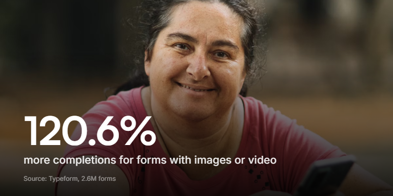
It pays off in completions too. Typeform's analysis of 2.6 million forms found forms with images or video saw a 120.6% jump in completions over plain ones - useful when your intake form is competing with a busy client's inbox.
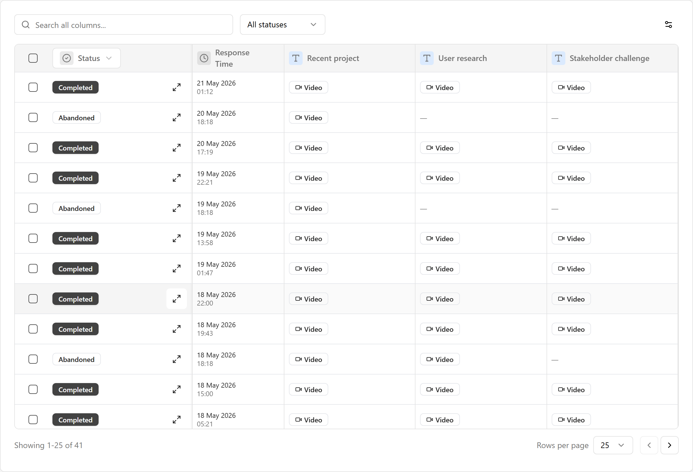
This is what tools like Clipform are built for. Each question is a short video prompt - you on camera, asking it the way you would on a call - and the client replies however suits them: a quick video, a voice note, or text. Every spoken answer is transcribed automatically, so you can skim and search responses instead of rewatching clips. For the format itself, there's a fuller breakdown in our guide to video questionnaires.
Designing for clients you'll never meet
Remote client work is the default now, not a pandemic hangover. Plenty of websites get built start to finish without the designer and client ever being in the same room. That makes the intake form do more lifting than it used to.
It also has to clear a higher bar. AI site builders like Framer and Webflow's AI tools mean clients now turn up with a rough mockup they generated themselves, and a sharper sense of what's possible. Some hand you a screenshot and say "like this, but ours." An intake that feels like a quick video chat lands better with those clients than a wall of form fields, and it lets you dig into the why behind the reference instead of guessing at it.
A long, dull form has the opposite effect. If your questionnaire feels like homework, clients rush it or abandon it half-done - the start of plain old survey fatigue, which hits client intake as hard as it hits any other form.
A free website design questionnaire template
Here's a 14-question starting point. Send it before the kickoff, keep it under ten minutes, and adapt the wording to your studio.
| # | Section | Question | Format |
|---|---|---|---|
| 1 | Business | What does your business do, in one sentence? | Open |
| 2 | Business | What's the single most important thing this site should achieve? | Open / video |
| 3 | Business | How will you measure success six months after launch? | Open |
| 4 | Audience | Who is the site for, and what do they come to do? | Open / video |
| 5 | Audience | Show me two or three competitor sites and your take on each. | Video |
| 6 | Look & feel | Show me three sites you love and what grabs you about each. | Video |
| 7 | Look & feel | What's an absolute no, design-wise? | Open / video |
| 8 | Brand | Do you have a logo, fonts, and colours, or is that part of the job? | Multiple choice |
| 9 | Features | What does the site need to do (booking, payments, blog, members)? | Open / video |
| 10 | Content | Who's writing the content, and is it ready? | Multiple choice |
| 11 | Scope | Roughly how many pages or sections are you picturing? | Open |
| 12 | Budget | What's your realistic budget range? | Multiple choice |
| 13 | Timeline | Is anything driving the launch date (a campaign, an event)? | Open |
| 14 | Process | How involved do you want to be in decisions and approvals? | Multiple choice |
Keep the open questions open. Resist adding example answers - they steer clients toward your expectations instead of surfacing theirs.
Lead with the video questions for competitors and look-and-feel, and use multiple choice only for brand, content, budget, and process. People answer faster when the easy picks are quick taps and the rich answers are spoken, not typed.
How to send one
You don't need specialist software. Any form builder that mixes short video prompts with a few multiple-choice questions will do. The setup is quick:
- Write your questions by section, keeping the whole thing to 12-14 items.
- Record your prompts - a few seconds each, in your normal voice, so it feels like talking to you.
- Set brand, budget, and process as multiple choice so qualifying answers are easy to compare.
- Send one link after the enquiry and before the paid kickoff.
- Read before you call, so the kickoff goes deep instead of covering basics.
On Clipform you can build this in about five minutes and send it as a single link. Clients reply with video, voice, or text - no app to download and no account to create on their side. Presenting one question at a time, the way a conversational form does, also stops a long brief from feeling like a chore. Designing physical spaces instead? The same approach works for an interior design questionnaire.
FAQ
What is a website design questionnaire?
It's an intake form you send a new client before starting a project. It captures the business and its goals, the target audience, the look and feel they want, the features the site needs, and the budget and timeline - so you understand the brief before the first design decision. It also helps qualify whether the client is a good fit for how you work.
What questions should a website design questionnaire include?
Cover five areas: the business and its main goal, the target audience and competitors, look and feel and brand (with examples rather than labels), features and content, and budget and timeline. The most useful design questions ask clients to show sites they love and name an absolute no, since dislikes are sharper than likes.
When should you send the questionnaire to a client?
After the initial enquiry but before the paid kickoff. That way the kickoff is spent going deeper on the brief rather than collecting basics. It also gives you time to spot a poor fit before committing.
How long should a website design questionnaire be?
Aim for 12 to 14 questions, under ten minutes to complete. Long forms get abandoned or rushed. If you need more detail, save it for the kickoff call, where a conversation surfaces it more naturally than another text box would.
Why use video answers in a design questionnaire?
Visual taste is hard to put into words. A client who types "clean and modern" tells you almost nothing, but the same person talking you through a site they love gives you the exact sections, layouts, and details a one-word answer hides. Speaking also gets longer, more honest answers than typing.
Get the brief right the first time
A good website design questionnaire saves you from building the wrong site. The questions matter, but the format matters just as much - a written form gets you style labels, while a short video answer gets you the picture in the client's head.
If your current intake form leaves you guessing, change one thing: swap the look-and-feel questions for video, and let clients walk you through the sites they love instead of trying to spell it out.
You can build a questionnaire like that on Clipform for free and have it ready before your next enquiry replies. Start with the 14-question template above, record your prompts, and let the brief tell you what the client actually wants.


