A creative brief is a short document that tells everyone on a project what you're making, who it's for, and why. A good one fits on a page or two and gets the whole team pointed the same way before anyone opens a design tool.
You came here for a template, so here it is: this guide gives you a free creative brief template to copy, a filled-in example to see how it reads, and the standard sections every brief should cover.
But a blank template won't fix the thing that derails projects. The problem was never the eight boxes. It's what goes in them. Marketers hand over briefs they think are crystal clear, agencies get vague adjectives and guesswork, and the work goes round in circles. So this guide does one more thing the other template pages skip: it shows you how to get a brief that's specific enough to act on the first time.

What goes in a creative brief
Most briefs cover the same ground, whether you call it a campaign brief, a design brief, or a project brief. The sections below are the ones that earn their place. Skip the rest.
- Project overview - one or two sentences on what this is and why it exists now
- Background and context - the business, the moment, what's happened before
- Objective - the single most important thing this work has to achieve
- Target audience - who you're talking to, what they already think, what you want them to do
- Key message - the one idea the audience should walk away with
- Tone and personality - how it should feel, in the brand's voice
- Deliverables - exactly what's being made, in what formats and sizes
- Mandatories - logos, legal lines, taglines, anything that must appear
- Timeline and budget - key dates, the sign-off chain, and what you're spending
Nine sections. Notice how many of them are about feel and intent rather than facts. The overview and deliverables write themselves. The objective, the audience, and the tone are where briefs go wrong, because they ask the client to put a feeling into words. Hold that thought.
The free creative brief template
Copy this straight into a doc, a project tool, or a form. Keep the whole thing to a page. If a section needs three paragraphs, the project is too big for one brief and wants splitting up.
| Section | What to write | Prompt to answer |
|---|---|---|
| Project overview | One or two lines | What are we making, and why now? |
| Background | 2-3 sentences | What does the business do, and what's happened that led to this? |
| Objective | One sentence | If this project does one thing, what is it? |
| Target audience | A short paragraph | Who is this for? What do they think today? |
| Key message | One sentence | What's the single idea they should remember? |
| Tone and personality | A few words plus an example | How should it feel? Show a brand that nails that feel. |
| Deliverables | A list | What exactly do we need, in what formats and sizes? |
| Mandatories | A list | What must appear? Logos, legal, taglines, links. |
| Timeline and budget | Dates and a number | When is it due, who signs off, and what's the budget? |
The single most useful line in any brief is the objective, written as one sentence. If you can't get it to one sentence, the project hasn't been decided yet - and no amount of great design will decide it for you.
A creative brief example (filled in)
A blank template only gets you so far. Here's the same structure filled in for a made-up brand, so you can see the level of detail that makes a brief usable. The brand is Driftwater, a small coffee roaster launching its first canned cold brew.
| Section | Example |
|---|---|
| Project overview | Launch campaign for Driftwater's first canned cold brew, aimed at getting it into people's hands over summer. |
| Background | Driftwater is a five-year-old roaster known for single-origin beans. Cold brew is the first ready-to-drink product and the first time we're competing on a shelf, not just online. |
| Objective | Make a coffee drinker who has never heard of us pick up the can. |
| Target audience | 25-40, drinks coffee daily, cares where it comes from, buys premium but hates when premium feels stuffy. Thinks canned coffee is a compromise. |
| Key message | Proper coffee, cold, in a can - no compromise. |
| Tone and personality | Warm, dry, a little cheeky. Think a good independent cafe, not a tech startup. Closer to Oatly's wit than a supermarket own-brand. |
| Deliverables | Can design, 3 social videos (9:16), 6 static posts (1:1 and 4:5), one hero image for the site. |
| Mandatories | Driftwater logo, "Roasted in Bristol" line, recyclable-can icon. |
| Timeline and budget | Concepts by 12 May, final assets by 2 June, launch 16 June. Budget £8k. Sign-off: founder only. |
Read the tone row again. "Warm, dry, a little cheeky" plus a reference the team knows tells a designer more than "premium but approachable" ever could. That's the difference between a brief that works and one that comes back for a fourth round.
Why most briefs fail, and it isn't the template
Here's the uncomfortable bit. The templates are fine. The briefing is broken, and there's hard data on how broken.
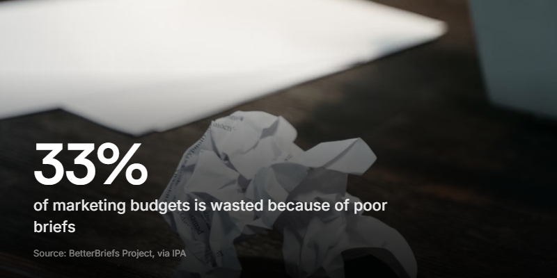
The BetterBriefs Project, run with the IPA, surveyed more than 1,700 marketers and agency staff across 70-plus countries. It found that roughly a third of marketing budgets is wasted as a direct result of poor briefs. Most of that goes on work that had to be scrapped and redone because the brief didn't say what it meant.
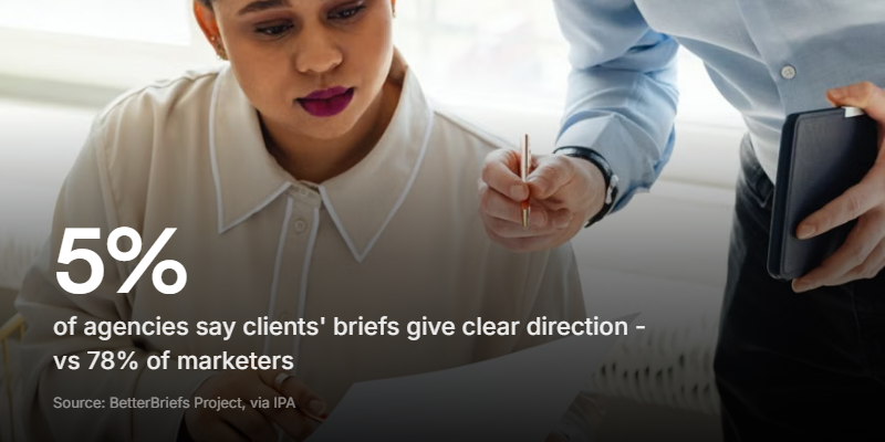
The reason that number stays high is a perception gap, and it's a big one. In the same research, 78% of marketers said the briefs they write give clear strategic direction. Only 5% of agencies agreed. Marketers think they're briefing well. The people receiving the briefs almost never see it that way.
A blind spot like that doesn't get fixed with a better form. You can't proofread your way out of not knowing you're unclear. What closes the gap is a briefing method that forces the fuzzy stuff - the objective, the tone, the "make it feel like this" - out into the open where the other side can actually hear it.
AI can write the brief now. That's the catch
Through 2025 and 2026, a wave of tools showed up that draft the brief for you. Feed in a product and a past campaign, and they'll spit out a tidy, formatted brief in seconds. Even Google shipped an AI brief feature for ad creative.
That's genuinely handy for the boilerplate. It's also exactly why the input matters more than it used to. AI is brilliant at formatting a brief and useless at knowing what you actually want. Give it a thin, vague starting point and you get a polished, vague brief - which is worse, because it looks finished.
The old rule holds. Garbage in, garbage out. When the formatting is free and instant, the only thing left that's hard, and the only thing that decides whether the work lands, is the quality of the raw thinking you put in. That raw thinking almost always lives in the client's head as a feeling, not a sentence.
The brief people actually finish
So how do you get the feeling out? You stop asking people to type it.
Ask a client "how should this feel?" in a text box and you get one word back. Premium. Fun. Clean. Each one is a placeholder for a picture in their head you can't see. Ask the same person to talk you through it for thirty seconds and the picture comes out. They light up describing an ad they love and you hear exactly what "premium" means to them. They pull a face at a competitor and you learn more from the face than from a paragraph.
Video does something a form can't: it captures tone. How a founder talks about their own product is half the brand voice already, sitting right there in the recording.
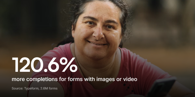
It also gets finished. A busy client who'd never type three paragraphs about tone will happily record a quick voice note. Typeform's analysis of 2.6 million forms found that forms with images or video saw a 120.6% jump in completions over plain ones. A brief only helps if it comes back filled in.
This is what a tool like Clipform is built for. You record each brief question as a short video prompt, in your own voice, the way you'd ask it on a call. The client replies however suits them: a quick video, a voice note, or a typed answer for the practical bits. Every spoken reply is transcribed automatically, so you can skim and search the brief instead of rewatching clips. And because it asks one question at a time, a long brief stops feeling like a wall of admin.
Instead of "list three brands you admire," you ask on camera: "Show me three ads you love and tell me what grabs you about each." The answer you get back is worth ten filled-in text fields.
The ad creative brief: a leaner cousin
An ad creative brief is the same idea, stripped down for a single piece of paid creative rather than a whole campaign. When you're turning out a dozen variations for testing, a full nine-section brief is overkill. You want the five things a designer needs to start.
| Section | What to nail |
|---|---|
| The one job | The single action this ad drives (click, install, sign up) |
| Audience and platform | Who sees it and where - a TikTok pre-roll isn't a LinkedIn static |
| Hook | The first three seconds or the headline that stops the scroll |
| Proof | The offer, stat, or feature that makes the claim believable |
| Format and specs | Aspect ratios, safe zones, length, file types |
Keep it to half a page. The point of an ad brief is speed and volume, so the brief itself has to be fast. The tone and personality still matter, but they come from your brand guidelines, not a fresh paragraph each time.
How to build an interactive brief in a few minutes
You don't need special software to brief this way. Any form builder that mixes short video prompts with a few multiple-choice questions will do. The setup is quick:
- Write your questions from the nine sections above, trimming any that don't apply.
- Record a short prompt for each - a few seconds in your normal voice, so it feels like talking to you.
- Set the practical bits as multiple choice - budget band, timeline, deliverables - so they're fast to answer and easy to compare.
- Ask for tone and references as video - this is where the real brief lives.
- Send one link and read the answers before your kickoff call, so the call goes deep instead of collecting basics.
On Clipform you can build this in about five minutes and send it as a single link. Clients reply with video, voice, or text, with no app to download and no account to create on their side. If the job is a full brand build rather than one campaign, pair it with a branding questionnaire for the identity groundwork, or a website design questionnaire if a site is in scope. And if the format is new to you, here's a fuller walk-through of video questionnaires.
FAQ
What is a creative brief?
A creative brief is a short document, usually a page or two, that defines a creative project before work starts. It covers what's being made, the objective, the target audience, the key message, the tone, the deliverables, and the timeline and budget. Its job is to get everyone - client, strategist, and designer - pointed the same way so the work doesn't need endless rounds of revision.
What should a creative brief include?
Nine sections cover almost any project: project overview, background, objective, target audience, key message, tone and personality, deliverables, mandatories, and timeline and budget. The objective, audience, and tone are the ones that decide whether the brief works, because they're about intent and feel rather than facts. Write the objective as a single sentence.
How long should a creative brief be?
One to two pages. If a brief runs longer, the project is usually too broad for a single brief and should be split. The goal is a document a designer can hold in their head rather than a spec they keep re-reading. For a single paid ad, half a page is plenty.
Why do so many creative briefs fail?
Because of a perception gap. BetterBriefs Project research found 78% of marketers think their briefs give clear direction, while only 5% of agencies agree - so briefs go out full of blind spots the writer can't see. The fix is a briefing method that draws out the fuzzy parts, like asking clients to describe tone and references on video instead of in a text box.
Can I use an AI tool to write a creative brief?
AI tools are good at formatting and filling in boilerplate, but they can't know what you have in mind. Feed one a thin, vague input and you get a polished, vague brief that looks finished but isn't. Use AI for the structure if you like, but put the real thinking in yourself - especially the objective and tone, which are the parts that decide the work.
Get the brief right before the work starts
A creative brief is cheap insurance. A page of clear thinking up front saves rounds of revision, wasted budget, and the slow grind of work that keeps missing. The template above gives you the structure. The example shows you the depth. But the part that moves the needle is getting a real answer out of the person you're briefing.
If your briefs keep coming back thin, change one thing: stop asking clients to type the hard parts. Let them talk you through the objective and the tone, show you the work they love, and say out loud what they mean by "premium." You'll hear the brief you were never going to read.
You can build a brief like that on Clipform for free and have it ready before your next project kicks off. Start with the nine sections, record your prompts, and let the client tell you what they're really after.