You've got a domain, a rough launch date, and no product to show yet. So you throw up a page that says "Coming soon" with a box that says "Notify me," and you wait.
That page has one job people forget. It should turn a stranger into a subscriber before you've shipped a single thing. A good coming soon page does two things at once: it builds enough anticipation that someone actually wants in, and it captures their email so you can reach them on launch day.
Most pages only do the second half. They ask for an email but give no real reason to hand it over. This guide covers what a coming soon page needs, the examples worth copying, and why a short video does the persuading that a plain "notify me" box never can.
What a coming soon page is really for
A coming soon page (sometimes called a pre-launch page or a waitlist landing page) is a single page you put up before your product, site, or store is ready. Its whole purpose is to collect emails from interested people so you launch to an audience instead of to silence. In that sense it's a focused lead capture landing page, built for the one moment before you're live.
The mistake is treating it like a placeholder. "We'll be back soon, leave your email" is a placeholder. It captures the handful of people who were already sold, and it lets everyone else leave.
The pre-launch moment is the most captive attention you'll ever get. Your site isn't live, so there's nowhere else for a curious visitor to click. That's the moment to make your case, not to shrug and show a form. Get it right and you walk into launch day with a warm list. Get it wrong and you're shouting into an empty room.
Show what's coming, don't just tease it
Here's the problem with a text-only page: you're asking people to get excited about something they can't see. A headline and a paragraph can describe your product. They can't make someone feel it.
A short video can. Thirty to sixty seconds of you talking to camera, a screen recording of the thing half-built, a quick montage of the problem you solve - any of these does more than three paragraphs of copy. People believe a face. And they'll watch a founder explain why they're building something long after they'd have stopped reading about it.
The data backs this up. According to Wyzowl's 2026 Video Marketing report, 85% of people say a video has convinced them to buy a product or service, and 83% of video marketers say video has directly increased their sales. That persuasion is exactly what a pre-launch page is trying to do, months before there's anything to buy.
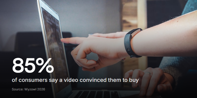
The difference in practice is stark. A visitor lands on a plain box, reads one line, and decides in a second whether to bother. A visitor who hits play watches you make the pitch, and by the time the video ends they've already talked themselves into wanting it. That short pitch does the same job as a video sales letter, just aimed at a signup instead of a sale.
| What matters | Static "notify me" box | Video coming soon page |
|---|---|---|
| Builds desire | A line of text | You make the case on camera |
| Explains the product | A short paragraph | Show it, don't describe it |
| Feels human | Generic template | A real face and voice |
| Captures the email | One field | Same field, right after the pitch |
What to put on your coming soon page
Resist the urge to add sections. Every extra block dilutes the one action you want. A strong coming soon page is short and has a clear spine:
- One specific promise. Say what you're building and who it's for, in a sentence a stranger gets instantly. "A budgeting app for freelancers with messy income" beats "reimagining personal finance."
- A reason to sign up now. Early access, a launch discount, a founding-member perk. People don't join waitlists for fun. Give them a payoff.
- One field: the email. Not name, company, and phone. Every field you add drops your signup rate. Ask for the email and nothing else.
- A pinch of proof. "Join 800 others on the list" or a single press mention. Even a small number tells a visitor they're not the first one here.
- A clear date, if you have one. "Coming October 2026" reassures more than "coming soon." It says you have a plan.
A countdown timer can lift signups when the date is real and fixed. If your launch keeps slipping, skip it - a timer that resets to zero and starts again does more damage to trust than no timer at all.
That's it. No long "about us," no five competing buttons, no newsletter-and-socials-and-blog. The page has one job. Protect it.
Coming soon page examples worth copying
The best pre-launch pages out there share a pattern, whatever the industry. Look past the visuals and you'll see the same moves:
- They lead with the hook, not the logo. The promise is the first thing you read, big and clear.
- They show something. A product mockup, a short demo clip, a peek at the dashboard. Anything that turns "trust me" into "look."
- They make the form impossible to miss. One field, one button, usually repeated at the top and bottom so you never have to scroll back up to sign up.
- They add a share loop. The pages that spread let people jump the queue by referring friends. Even a simple "skip the line" mechanic turns one signup into three.
- They sound like a person. The winners have a voice. The forgettable ones read like a settings page.
You don't need a design team to copy these. You need a clear promise, one field, and something to show.
How to build a coming soon page
You've got two broad options. Use a dedicated builder, or bolt a form onto a simple holding page. Either way, the steps are the same:
- Register the domain and put up a holding page. Even a single static page is enough. Getting the URL live early also lets search engines start indexing your domain before launch.
- Record a short video. Talk to camera for 30 to 60 seconds, or screen-record the product so far. Rough and real beats polished and vague.
- Add one email field. Right below the video, so the sign-up comes the second someone's convinced.
- Send new signups where you'll actually use them. Pipe them into whatever email tool you'll send your launch announcement from.
- Drive traffic and watch the number climb. Share it everywhere you can and keep an eye on how many visitors turn into signups.
This is the kind of page Clipform is built for. You add a video prompt at the top, drop in a details step that collects just the email, and finish with a thank-you screen - a video coming soon page and the signup form in one flow, on one link. You can embed it on your holding page or share the link on its own.
Because Clipform is a form under the hood, each signup is a response you can export or push straight to your email tool through Zapier, Make, or a webhook. The built-in analytics show how many people viewed the page and how many actually signed up, so you can tell whether your video is doing its job or your headline needs work.
A coming soon page is really a specialized version of a lead capture form, so the same rules apply: fewer fields, a clear value exchange, low friction. Our guide to high-converting lead capture forms goes deeper on all three.
It's a mobile moment
Most of the people hitting your coming soon page are on a phone. That link you drop in a tweet, a DM, a story, an ad - it opens on mobile far more often than on a laptop.
Unbounce's Conversion Benchmark Report, built on more than 57 million conversions, found that 83% of landing page visits happen on mobile, yet mobile converts about 8% less than desktop. That gap is mostly a form problem: fields too small to tap, the wrong keyboard popping up, layouts that fight the screen.
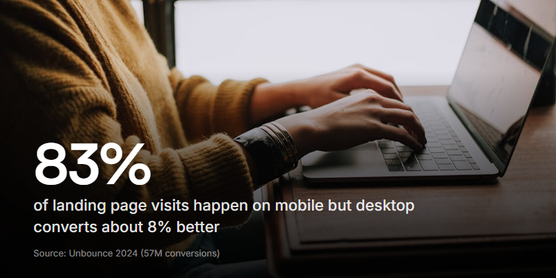
So test your page on your own phone before you share it. The email field should be easy to tap, the video should play without a fuss, and the whole thing should load fast on a patchy connection. A one-question, one-tap flow beats a cramped desktop form squeezed onto a small screen.
Coming soon pages on Shopify
Opening a store is the classic case. Shopify has a built-in option for this: the password page. Turn on password protection and visitors see a holding page with an email field until you're ready to open.
It does the basic job, but it's plain. It's a static box with a line of text, which is exactly the setup that leaves signups on the table. If you want the store's coming soon page to actually build hype, embed a short video form on it or link out to a dedicated pre-launch page, then flip the password off on launch day.
The same goes for any platform with a native "coming soon" toggle. Use it to hold the space, but don't mistake the default box for a page that's working hard to grow your list.
Waitlist page, coming soon page, landing page: what's the difference?
These terms get used interchangeably, and mostly that's fine. They all describe a pre-launch page whose job is to capture interest before you're live. The small differences are worth knowing:
| Term | What people usually mean |
|---|---|
| Coming soon page | A holding page for a site or store that's not open yet |
| Waitlist landing page | A page for a product where signing up means early or priority access |
| SaaS waitlist landing page | The same, for software - often with early-access or beta framing |
| Pre-launch landing page | The catch-all for any of the above |
The mechanics don't change with the label. Make one specific promise, show something, ask for the email, and give people a reason to say yes today. Whether you call it a waitlist or a coming soon page, the page that wins is the one that persuades before it asks.
Frequently asked questions
How long should a coming soon page run before launch?
Four to twelve weeks is the sweet spot. Long enough to build a real list, short enough that the excitement doesn't fade before you open. Start driving traffic the day it goes live, not the week before launch.
Do coming soon pages help with SEO?
A little. Putting your domain live early lets search engines start crawling and indexing it, and you can set your title and description ahead of time. It won't rank you on its own, but it beats a dead domain sitting on a parking page.
Should I ask for more than an email?
Rarely. Every extra field costs you signups. The email is all you need to reach people on launch day. If you genuinely need more, collect it after they've joined, not before.
What's the difference between a coming soon page and a waitlist?
Almost nothing. A waitlist usually implies signing up gets you early or priority access, while a coming soon page is a general holding page. Both exist to capture emails before you launch.
Start building your list before you launch
A coming soon page is the cheapest audience you'll ever build. The traffic is captive, the ask is small, and every email you collect now is someone you can reach the day you open.
Just don't waste the moment on a box that says "notify me." Show people what's coming, make one clear promise, and ask for the email right after you've earned it. A short video does more of that work than any amount of clever copy.
When you're ready to build one, start with Clipform - it turns the video and the signup into a single page you can share on one link. Or read the lead capture guide first if you want to squeeze every last percent out of the form itself.