A lead capture landing page has one job: turn a visitor into a lead by trading something they want for their contact details. You give them a reward - a demo, a guide, a discount, early access - and they give you an email. That's the whole exchange.
Most pages get the exchange wrong in the same way. They describe the offer instead of selling it. A headline, a paragraph, a form, a button, and a hope that the visitor cares enough to fill it in. Some do, most don't.
This guide covers what a lead capture landing page actually needs, why the message on the page has to match the ad that sent people there, and why a short video does the persuading that a static hero image never can.
What a lead capture landing page actually is
A lead capture landing page (sometimes called a lead generation page) is a single page built around one action: capturing a contact. It has two moving parts. The ask is the information you want - usually just an email. The reward is what you give for it.
That single goal is what separates it from your homepage. A homepage has a dozen exits: nav links, a blog, an about page, social icons. A lead capture page has one way forward and no way sideways. Every link that isn't the form is a leak.
Here's the part people forget: this page almost never gets visited by accident. Someone clicked an ad, tapped a link in an email, or followed a post to get here - traffic you usually paid for. So the page can't afford to wander. It has one visitor, one message, and a few seconds to earn the email.
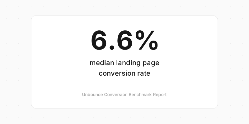
And the bar is lower than most people think. According to Unbounce's Conversion Benchmark Report, which analysed 464 million visits across more than 41,000 landing pages, the median landing page converts at just 6.6%. Half of all pages do worse than that. The offer and the format you pick move that number far more than another thousand visitors would.
The parts every lead capture page needs
Strip a high-converting lead capture page down and you get the same short spine every time. Add more than this and you dilute the one action you want.
| Element | Its job |
|---|---|
| Headline | State the reward in one line a stranger gets instantly |
| The visual | Show what they get, don't just describe it |
| Social proof | A number, a logo, or a quote that says others trust you |
| The form | Ask for the minimum, usually one field |
| One CTA | A single button with a single next step |
| Nothing else | No nav, no footer links, no competing offers |
That last row is the one people fight. It feels wrong to strip the navigation off a page. But a lead capture page isn't a website, it's a decision. The fewer choices on it, the more likely the visitor makes the one you want.
Marketers call this the attention ratio: the number of things you can click versus the number of things you want clicked. On a lead capture page, aim for one to one. One page, one action.
Message match makes or breaks it
Here's the fastest way to waste a lead capture page: promise one thing in the ad and say something else on the page.
Someone clicks an ad that says "Free 2026 hiring playbook." They land on a page headlined "Welcome to our platform." In the half-second it takes to notice the mismatch, they're gone. The click cost you money. The bounce gave you nothing.
Message match means the page picks up the exact promise that drove the click and delivers on it above the fold. Same words, same offer, same tone. If the ad said "playbook," the headline says "playbook." It sounds obvious, and it's the single most common thing broken on real pages.
This matters more when the traffic is paid. A lead capture page usually sits at the end of an ad you're bidding on click by click, so a weak page doesn't just convert badly, it burns the ad budget that fed it. Fixing the match between ad and page is often a bigger win than fixing the page itself.
Show what they get, don't just describe it
Most lead capture pages try to build desire with words. A punchy headline, a few benefit bullets, maybe a stock photo of someone smiling at a laptop. It's all describing. None of it is showing.
A short video shows. Thirty to sixty seconds of you explaining the offer, a quick screen recording of the product, a founder talking straight to camera - any of these does more than three paragraphs of copy. People believe a face, and they'll watch someone explain a thing long after they'd have stopped reading about it.
The numbers back this up. Wyzowl's 2026 Video Marketing report found that 85% of people say a video has convinced them to buy a product or service, and 85% of video marketers say video has directly helped them generate leads. That persuasion is exactly what a lead capture page is trying to pull off, in the few seconds before it asks for an email.

This is the kind of page Clipform is built for. You put a video prompt at the top to make your case, add a step that collects just the email, and finish with a thank-you screen - the pitch and the capture in one flow, on one link. Because it's a form underneath, every signup lands as a response you can export or push straight into your email tool through Zapier, Make, or a webhook. The built-in analytics show how many people viewed the page versus how many signed up, so you can tell whether the video is doing its job or the headline needs work. If you want it done for you rather than built by hand, the lead capture software assembles the whole flow.
Keep the form to the minimum
The form is one element of the page, not the page itself. And every field you add to it costs you conversions. Name and email is plenty for most offers. Phone number, company size, job title - each one is a tax on attention, so unless you'll use it to route the lead, cut it.
If you do need to qualify harder, ask one open question or let people record a short video reply instead of filling in five boxes. A conversational form that asks one thing at a time converts better than a wall of fields, because it never shows the visitor the full length of the ask up front.
The form deserves its own deep-dive. Our guide to high-converting lead capture forms covers field count, progressive disclosure, and video responses in full - this page is about the page around it.
Make it fast, and build it for the thumb
Most people hitting your lead capture page are on a phone. That link in a story, a DM, or an ad opens on mobile far more often than on a desktop. Unbounce's report found that 83% of landing page visits happen on mobile, yet mobile converts about 8% less than desktop - a gap that's mostly down to form UX. Fields too small to tap, the wrong keyboard, layouts that fight the screen.

Speed is the other silent killer. Portent's page speed study, built on more than 100 million page views, found that a B2B lead generation page loading in one second converts three times higher than one that takes five seconds. On a lead capture page fed by paid traffic, a slow load burns money twice: once on the click, again on the visitor who leaves before the page paints.
So test the page on your own phone before you spend a penny driving traffic to it. The email field should be easy to tap, the video should play without a fuss, and the whole thing should load fast on a patchy connection.
Types of lead capture landing page
The spine stays the same, but the reward changes with the goal. These are the ones you'll build most:
| Type | The reward | Best for |
|---|---|---|
| Demo request | A live walkthrough | B2B software, higher-priced tools |
| Lead magnet | A guide, template, or checklist | Top-of-funnel email list building |
| Newsletter | Ongoing useful content | Creators, media, community brands |
| Free trial | Hands-on access to the product | Self-serve SaaS |
| Waitlist | Early or priority access | Pre-launch products and stores |
The waitlist is a special case worth its own read - a coming soon page built before you launch is the cheapest audience you'll ever gather, because the visitor has nowhere else to click. Whatever the type, the moves are identical: one promise, something to show, a small ask, and a reason to say yes now.
How to build a lead capture landing page
You don't need a design team. You need a clear promise and one field. The steps:
- Match the message. Whatever the ad, email, or post promised, lead with that exact promise on the page.
- Write a one-promise headline. Say what they get and who it's for in a sentence a stranger gets instantly.
- Show it with a short video. Thirty to sixty seconds. Rough and real beats polished and vague.
- Ask for the minimum. One field if you can. Every extra field costs signups.
- Add a pinch of proof. A user count, a logo, or one short quote. Even a small number reassures.
- Strip the distractions. Kill the nav, the footer links, and any second call to action.
- Test it on your phone. If it's awkward to tap or slow to load, fix that before you drive traffic.
- Send traffic and measure. Watch the view-to-signup rate and change one thing at a time.
That last habit is the one that compounds. A lead capture page is never finished. Change the headline, swap the video, cut a field, and keep the version that wins.
Frequently asked questions
What's the difference between a lead capture landing page and a lead capture form?
The form is the part that collects the details. The landing page is the whole page built around it - the headline, the offer, the proof, and the form together. A great form on a page with no reason to sign up still converts badly, which is why the page matters as much as the fields.
How many fields should a lead capture page have?
As few as you can get away with. Email alone is ideal for most offers. Only ask for more when you'll actually use it to route or qualify the lead, and collect the rest after they've signed up, not before.
What's a good conversion rate for a lead capture landing page?
The median across industries is about 6.6%, per Unbounce, and the top quarter of pages clear 10%. Where you land depends on your traffic and offer, so treat your own first result as the baseline to beat, not a pass or fail.
Do I really need a video on the page?
No, but it helps. A video makes your case in a way copy can't, and 85% of people say a video has convinced them to buy something. If you only change one thing on an underperforming page, swapping a static hero for a short video is a strong place to start.
Build a page that earns the email
A lead capture landing page lives or dies on one thing: whether it persuades before it asks. The pages that convert make one clear promise, show what they're offering instead of describing it, keep the ask tiny, and load fast on the phone where most people see them.
Start with the message match, because a page that doesn't deliver what the ad promised loses before it's read. Then let a short video do the selling, and ask for nothing more than the email you need.
When you're ready to build one, start with Clipform - it turns the video and the signup into a single page you can share on one link. Or read the lead capture form guide first if you want to squeeze every last percent out of the fields themselves.