
Pull up your own form on your phone and try to finish it with one thumb. If you had to pinch, zoom, or type a paragraph on glass, so does everyone you sent it to.
A mobile-friendly form is one people can finish on a phone without zooming in or typing more than they need to. In practice: one question per screen, big buttons where thumbs reach, the right keyboard for each field, very little typing, and the option to answer open questions by voice or video.
It's worth getting right, because your visitors are already on their phones. Mobile phones made up 58.99% of web traffic worldwide in September 2026, according to StatCounter. But phones still finish fewer forms than laptops do. Here's why, and the seven rules that fix most of it.
Why do people give up on forms on their phones?
Phones make forms slower and fiddlier. Buttons are small, the keyboard covers a big chunk of the screen, notifications pull people away, and typing with your thumbs is slow.
You can see it in the numbers. Zuko's 2025 form benchmark, which tracked over 93 million form sessions, found that 55.5% of people who start a form on desktop finish it. On mobile, it's 47.5%.

Typing is a big part of that gap. In an Aalto University study of 37,370 volunteers, people typed an average of 36.2 words per minute on mobile, about 70% as fast as on a full keyboard. Every text box costs more on a phone than it does on a laptop.
And here's the trap. Most form builders are responsive now, so your form probably fits the screen. Fitting the screen is the bare minimum, though. A form can fit perfectly and still ask someone to type three paragraphs with their thumbs.
1. Show one question per screen
On a phone, one question at a time beats a long scrolling page. When the keyboard opens, it takes over a big part of the screen. On a long form, the question someone's answering can scroll right out of view.
One question per screen keeps the question visible, gives every answer a full-width button, and makes progress feel quick. Each tap moves people forward, which feels a lot lighter than scrolling down a wall of fields. (We go deeper on this format in our conversational form guide.)
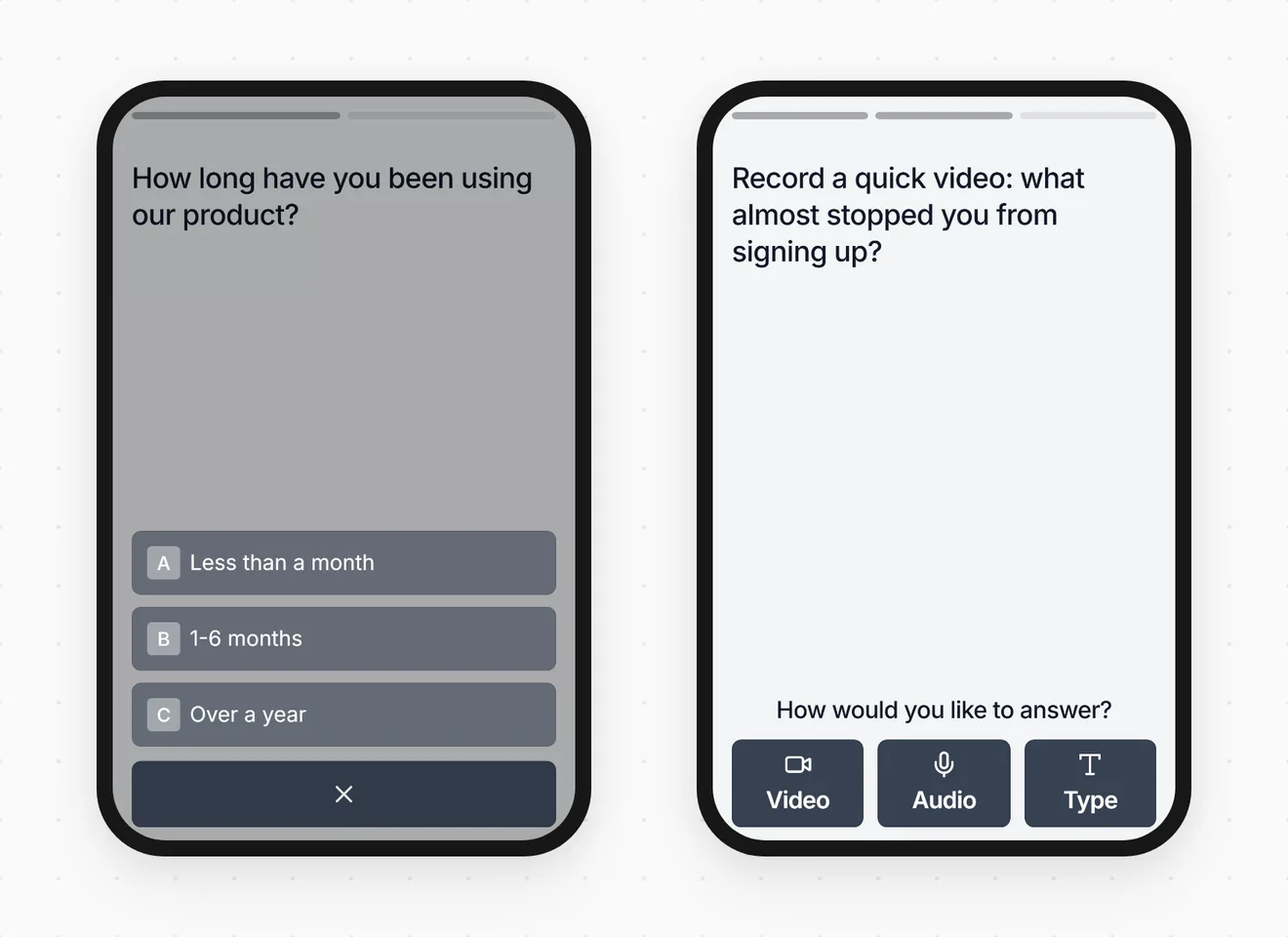
If one per screen isn't an option, at least stick to a single column. Side-by-side fields, like first and last name next to each other, get squeezed into slivers on a phone.
2. Ask for less, and turn typing into tapping
The fastest field to fill in is the one you deleted. For every field, ask what you'll actually do with the answer. If you can't name something, cut it.
Then look at what's left and swap typing for tapping wherever the answers are predictable:
| Instead of | Try |
|---|---|
| A dropdown with four options | Four full-width buttons |
| A "What's your role?" text box | A tap list of your five most common roles |
| A grid of 1-5 ratings | One rating question per screen |
| A full postal address | Just the ZIP code, if that's all you use |
| A date of birth | A yes/no "Are you over 18?", if that's the real question |
Dropdowns are a particular pain on a phone. A four-option dropdown means tapping to open it, scrolling a tiny picker, and tapping again to confirm. Four buttons take one tap. Save dropdowns for long lists, like picking a country.
On a lead form, this step is where most of the easy wins are. Our lead capture form guide covers which fields earn their place.
3. Bring up the right keyboard
Set each field to the right type and the phone shows a keyboard built for it: an @ key for email, a number pad for phone numbers. Get it wrong and people go hunting through keyboard layers for a symbol.
| Field | Set it as | What the phone shows |
|---|---|---|
type="email" | A keyboard with the @ key up front | |
| Phone number | type="tel" | A phone keypad |
| Age, quantity, ZIP code | inputmode="numeric" | A number pad |
| Website | type="url" | A keyboard with the / key handy |
| Date | type="date" | The phone's own date picker |
Add autocomplete hints too, like autocomplete="email" or autocomplete="tel". They let the phone offer saved details in one tap, so nobody types their own email address for the hundredth time. If you're building by hand, MDN's inputmode reference lists every keyboard option.
Not writing code? You don't need to. Pick the matching field type in your form builder (Email, Phone, Number) instead of a plain text box, and it sets the keyboard for you. In Clipform's details step, for example, email fields bring up the email keyboard and phone fields get a keypad with a country picker.
4. Let people talk instead of type
For open questions, let people answer by voice or video. Speaking is much faster than thumb-typing, so you get fuller answers from people who'd otherwise type "fine" and move on.
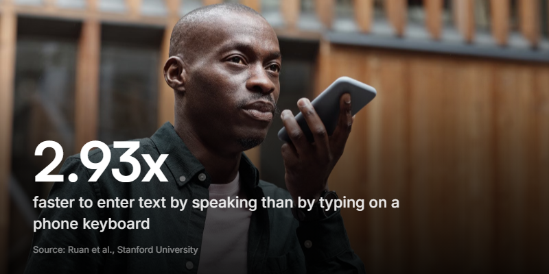
The gap is big. In a Stanford University study with Baidu and the University of Washington, people entered English text 2.93 times faster by speaking than by typing on an iPhone keyboard: 153 words per minute against 52.
Voice answers used to have a catch. Somebody had to sit and listen to all of them. AI transcription has mostly fixed that, so a spoken answer now comes back as text you can read, search, and quote, just like a typed one. In Clipform, open questions can take video, audio, or text answers (like the right-hand screen above), and voice and video answers are transcribed automatically.
It isn't right for every moment. Someone on a busy train won't want to record, some people hate being on camera, and sensitive topics often feel safer typed. So offer all three and let people choose. The person on the train types. The person on their sofa talks.
Got three open text boxes on your form? Try cutting them to one good question and letting people answer it out loud.
5. Size everything for thumbs
Make every button at least 44 x 44 points, keep form text at 16px or bigger, and put the main button low on the screen.
- Tap targets. Apple's design guidelines say a button needs a hit area of at least 44 x 44 points. WCAG 2.2, the current web accessibility standard, sets the minimum at 24 x 24 pixels. Full-width answer buttons clear both easily.
- Space. Leave a gap between options so a thumb doesn't hit two at once.
- Reach. Put the main action near the bottom. Held in one hand, a phone's bottom edge is far easier to reach than its top corners.
- Text size. On iPhones, Safari zooms the page in when someone taps a field with text smaller than 16px. It's jarring, and it's the easiest mobile bug to fix: set form text to 16px or larger.
- Labels. Keep labels above fields, not inside them as placeholder text. Placeholders vanish as soon as someone starts typing, which Nielsen Norman Group points out strains short-term memory. On a phone, with the keyboard hiding half the form, the label might be the only clue left.
Quick check: if you have to zoom in to tap something, it's too small.
6. Show errors early and save progress
Flag a mistake right next to the field, as soon as someone moves on, and never wipe what they've already typed. Then make sure an interruption doesn't cost them their answers.
- Errors at the field, not the top. An error message at the top of the page is easy to miss on a phone. By the time someone taps Submit, the top of the form is a long scroll away.
- Keep their answers. If a form clears itself after an error, don't expect anyone to type it all again on a phone.
- Plan for interruptions. Phones get interrupted all the time: a call, a message, a train pulling into a station. Let people leave halfway and continue where they left off. Clipform does this for respondents, and it's on by default.
- Skip the picture puzzles. If you need spam protection, use an invisible check instead of a CAPTCHA. Picking out traffic lights on a phone screen is nobody's idea of fun.
7. Test it on a real phone before you share it
Before you send the link, fill in the form yourself on an actual phone. It takes two minutes and catches problems no desktop preview will.
- Open the real share link on your phone, over mobile data rather than Wi-Fi.
- Fill it in one-handed, with your thumb.
- Tap into every text field. Does the keyboard open? Is it the right one? Can you still see the question and the button to continue?
- Get something wrong on purpose. Is the error clear, and is everything you typed still there?
- Switch apps halfway through, then come back. Are your answers still there?
- Check nothing covers the form, like cookie banners, chat bubbles, or newsletter pop-ups.
- If you can, borrow a phone from the other camp (Android if you're on iPhone, or the other way round).
Once responses start coming in, check two numbers: how many of your respondents are on phones, and which question people drop off at. Clipform's analytics break views down by device and show drop-off for every question, so you can see exactly where a form loses people.
Why isn't a desktop preview enough?
Because a desktop preview doesn't have an on-screen keyboard, and the keyboard is behind most mobile form problems.
Shrinking your browser window shows you the layout. It won't show you a keyboard that pops up and hides the question, a Submit button stuck under the keys, or a text box that refuses to open the keyboard at all. On a laptop, all of those look fine. On a real phone, you'll spot them in seconds.
If your form builder has a mobile preview, use it to check the layout. Then do the real test: your thumb on a real screen.
What's different about a mobile survey?
A mobile survey needs to be shorter and simpler than a desktop one, with no grids and an easy way to explain the "why". Everything above applies, plus a few survey habits:
- Keep it to five questions or fewer. Length hurts more on a phone. Our guide to increasing your survey response rate covers how to cut a survey down.
- Break up grids. Matrix questions, the tables of radio buttons that rate several things at once, are miserable on a small screen. Ask each one as its own one-tap question.
- Keep scales short. A 1-5 scale fits across a phone screen. A 0-10 scale needs eleven buttons, so check they're still big enough to hit.
- Ask "why" out loud. Follow a rating with one open question people can answer by voice. Thirty seconds of someone explaining a low score tells you more than a typed "meh".
- Send it where phones are. A text message, a link inside your app, or a QR code survey right where the experience happens.
Where Clipform fits
Clipform forms are built for phones first. They run one question at a time, with answer buttons at the bottom of the screen where thumbs reach. Open questions can take video, audio, or text, recorded right in the browser with no app to download. Voice and video answers are transcribed automatically, so you read replies instead of rewatching clips.
Here's the form from the screenshots above. It works on a laptop, but it's better on a phone, so open this page on yours and give it a go.
Try a phone-friendly feedback form
One question per screen, with a video, audio, or text answer in the middle.
It's a live demo, so answers reach the Clipform team. Skip anything private.
Copy this templateTry a phone-friendly feedback form
One question per screen, with a video, audio, or text answer in the middle.
It's a live demo, so answers reach the Clipform team. Skip anything private.
Copy this templateIt won't fix a form that asks too much. Send twenty questions and you'll get twenty nicely sized questions. But once you've trimmed the form down, it handles the phone part for you.
Common questions about mobile-friendly forms
What makes a form mobile friendly?
You can finish it on a phone without zooming, scrolling sideways, or doing much typing. That usually means one question per screen (or at least one column), buttons of at least 44 x 44 points, text at 16px or bigger, the right keyboard for each field, and the option to answer open questions by voice or video.
How many questions should a mobile form have?
As few as you can get away with. For surveys, aim for five or fewer. For a lead form, a name, an email, and one question about what they need is often enough. Every field costs more on a phone, because people type more slowly on one.
Should mobile forms use dropdowns?
Only for long lists, like picking a country. For a handful of options, full-width buttons are faster: one tap, instead of opening a picker, scrolling, and confirming.
How do I test if my form works on mobile?
Open the real link on a real phone, over mobile data, and fill it in one-handed. Tap every text field to check the right keyboard opens and the continue button stays visible. A desktop browser's phone preview can't show keyboard problems, because it doesn't have an on-screen keyboard.
What is a mobile survey?
A survey designed to be answered on a phone. It's short, shows one question per screen, uses tap-friendly answers, and usually gets shared by text message, QR code, or inside an app.
Start with the phone in your pocket
Most people will meet your form on a phone, and phones are less forgiving than laptops. The fix is mostly subtraction: fewer fields, fewer keystrokes, fewer tiny things to aim at.
So run the two-minute phone test today. Whatever annoys you on your own phone is annoying everyone else too. Fix that first, then work through the rules from the top.
If you'd rather start from something that already works on a phone, browse the templates - every one runs a question at a time. And if most of your traffic comes from paid social, see how marketers turn lead forms into short video conversations.